
![]()
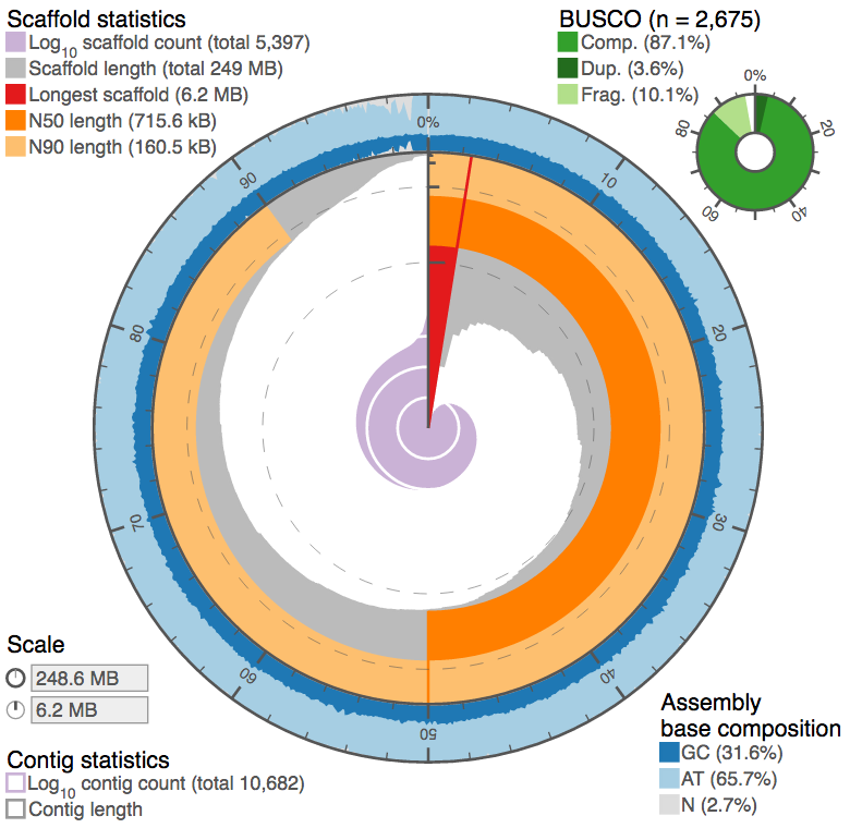
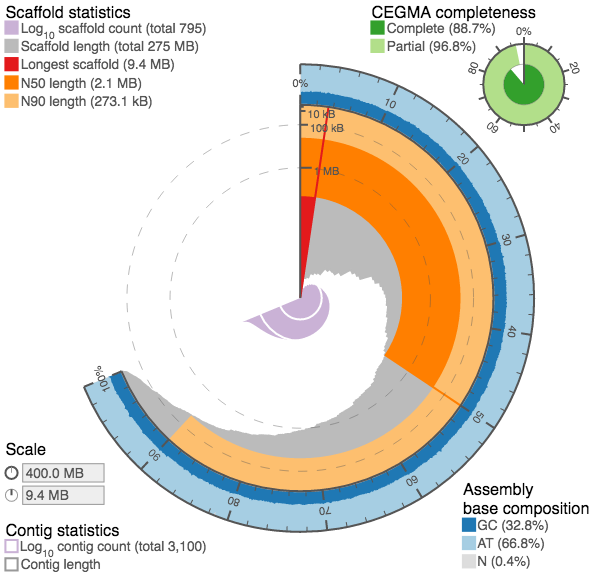
We introduced a new kind of assembly statistic plot (github.com/rjchallis/assembly_stats) to the species pages at ensembl.lepbase.org with release 1. With release 3 we have moved to generating the data for these plots directly from the ensembl databases with easy import and have added tabular and cumulative distribution plots based on the same data.
The circular plots were designed to provide an at-a-glance summary of some key assembly metrics to make it easier to judge the quality of an assembly without explicit reference to alternate assemblies. Typically a large red segment (longest scaffold represents a significant proportion of the assembly) and small central pink/purple area (small number of contigs) are features of a good assembly, but the more you look at, the more readily you should be able to spot interesting features. With the latest version of the plots, alternate assemblies can be compared directly so the different presentation types can be explored to allow a detailed assessment of the differences between assemblies.
If you’re after more information on how to interpret these circles then take a look at the project documentation or go directly to the github repository.
Since version 1.1, the circular plots also support BUSCO and have a handy script to generate pre-binned input data for those genomes with hundreds of thousands to millions of scaffolds…